| Entrance | Mainstreet | Wiki | Register |
|
# of watchers: 11
| D20: 19 |
| Wiki-page rating |  Stumble! Stumble! |
| Informative: | 0 |
| Artistic: | 0 |
| Funny-rating: | 0 |
| Friendly: | 0 |


2010-05-12 [*Phoenix*]: Oooh. That's awesome!! I love it!
2010-05-12 [Chel.]: Interesting! Love the colors and the tail! Although it reminds me of an earwig :P
My crit would be that the bone parts dont really look grounded to the scaley skin. Perhaps darken the skin under the bone?
I personally think the red bars distract, too.
2010-05-12 [Eyonic]: See, i couldn't figure out how to get the bone parts to look attached, but i will try that! and the red bars was randomness for the most part XD
2010-05-12 [Aeolynn]: I already said this on the second wiki you posted, but it must have gotten lost when you updated it... but I absolutely LOVE the shape of it, as well has the teal/purples in the body, and the tail is awesome, you don't really see tail shapes like that.
2010-05-17 [arthemis_]: OH I love the extern skeleton! Especially the horns and the tail. Really wicked! The contrast between the cool blue/green and the warm red tints is also really well done, don't know if you choose that deliberate or it's a lucky incident, but it really works. My only point of critique would be that if it was a piece of mine, I would have tilted the dragon a bit more to the right, making the legs level. But that's just me :)
2010-05-17 [NOOOPE]: Very cool. I agree with Chel about the bone parts (which are sweet). I also find the BG a little distracting. There's something about how the critter just barely overlaps the red than for whatever reason is throwing me off... Maybe if it overlapped more and was cropped? Meh, don't know what I'm saying.
2010-05-18 [Eyonic]: Actually, the red color was me going 'omg what color should i use???' red just seemed good at the time XD
2010-05-19 [Pnelma Tirian]: the design is awesome. I think you best integrated the bone in the skull--I'd take that fade-in and replicate it whenever bone comes to the surface. The bone comes up through the body and there's a layer of skin around where it comes through, like at the base of your fingernails. The dragon's ribcage feels very solid. :D His face is a little fuzzy, though; it could use some going back and making the details more clear.
2010-05-20 [The Dizzy Raven]: This is my favorite one out of all the artpieces you did, Eyonic!!!! Beautiful job!!! :D
2010-05-20 [Falx]: This is really beautiful. Your dragon is both elegant and graceful. And the colors are spectacular. ^_^ *loves*
2010-05-20 [pegasus1000]: I am not sure if I like the wings in general because they don't seem big enough, but that is just an opinion of the style. I love the tail it reminds me of a scorpions or a Rattle Snake tail. The color and shading are great, I am glad you went with red for the wings it ties into the end of the tail. I can’t decide if this is a Good or Evil dragon… That can’t be good (right).
2010-05-23 [Eyonic]: >.> or is it a evil good dragon? :O
2010-06-19 [Eyonic]: New drawing up
2010-06-19 [Chel.]: I love the contras you get in the wings and in the clothing! You have a good handle on texture too! The only thing is that I which there was more contrast in the skin tone. :3 Great job!
2010-06-19 [pegasus1000]: Great Job I love it. To answer the question of does it need a background the answer is yes. All great pics deserve at least a ground to "stand" on.
2010-06-19 [Pnelma Tirian]: it definitely deserves a background. The character design is awesome. The scales and robe are very beautifully rendered, but I agree with pegasus--a shadow, at least, to imply the ground would be enough. I would love to see a definitive light source in the environment to light him with, even if it is just the sun <3! The design on his tail is subtle but awesome.
2010-06-19 [arthemis_]: I really love it! Awesome snake-tail. Face is awesome. Wings, I think suits the character. Only thing I didn't like was his hand in which he holds the flame. It seems too 'squashy' for him. As hands are horrors, I forgive you for that ;) (as if I could do it better *rolls eyes*) Total outcome: 8/10. Any background would made it 9/10 :P
2010-06-19 [Falx]: What can I say that hasn't already been said? It's a good pic, though I feel that there should be more framework for the wings. More bones holding the membrane in, as it were. But that's probably because I'm staring at a poster of dragons at the moment. All in all, love the textures and shading, so give that boy someplace to stand! ^_^
2010-06-20 [Eyonic]: :D now i have to get a workin on a background for my scaly friend. thank you for the critiques
2010-06-20 [Eyonic]: yay backgrounds
2010-06-20 [Falx]: I like it. It looks kind of volcanic.
2010-06-20 [The Dizzy Raven]: Very gorgeous! :) I love the choices of color
2010-06-20 [Pnelma Tirian]: looks awesome! But on my screen it got a little pixelated. :/ excellent background, though!
2010-06-21 [Eyonic]: :D
2010-06-21 [Aeolynn]: I always like your use of pastel colors :]
2010-06-21 [Chel.]: MUUUUCH better! I love how you chose blue fire! :3
2010-06-21 [pegasus1000]: Love the background it's sweet. It almost lookes like he is half off the cliff.
2010-06-25 [arthemis_]: And now it's finished! Bravo!
2010-06-28 [Pnelma Tirian]: lol! that's super cute! My only suggestion would be to let the shoulder come forward to rest on the ground so you can see his shoulderblade. The fur and anatomy are excellent! Well done!
2010-06-28 [Chel.]: I love the doggy feet! :3 The fur is very nice too!
2010-06-28 [Falx]: Very cute! I like how he has some humanish quality about him.
2010-06-28 [arthemis_]: Really cute! He looks like he's falling flat faced sleeping and now he's dreaming something sweet.
2010-06-28 [Eyonic]: :D doggy feet!
2010-06-30 [NOOOPE]: You've really done well on the fur here. Fur is extremely difficult for people, and you've pulled it off very nicely. I find his anatomy convincing, his pose adorable... it's very good. I just wish it wasn't on white, you know? A very detailed BG would detract from him, sure, but the white is so blaaah. It could work as a PNG maybe... If you want I'll slide you some info about them.
2010-07-01 [Eyonic]: *is curious* :O please enlighten me
2010-07-01 [NOOOPE]: Well, first, what program are you using?
2010-07-01 [Eyonic]: photostudio 5 :/
2010-07-01 [Chel.]: :[
2010-07-07 [Daisy_Sandybanks]: Very cute. Coloring is nice, I agree with [NOOOPE] on the background though. The pose is nice, but a little awkward. Maybe bring his arm forward?
2010-07-11 [pegasus1000]: Very cute, [NOOOPE] covered just about everything I would say the color on the dag is great.
2010-08-21 [Chel.]: Cool textures! :3 My suggestion would be to sharpen the creature's overall outline, it's a tad too fuzzy.
2010-08-21 [pegasus1000]: I like how the fins seem furry. Very nice texture, I could go on for a while on how much I like this one. The skeleton would be awesome especially the neck and shoulders into the tail.
2010-08-21 [Aeolynn]: He feels a bit cramped to me, maybe try making the bg bigger?
2010-08-21 [Eyonic]: I wondered about the bg size, but got a little too lazy lol. He took long enough to color as is
2010-08-22 [Pnelma Tirian]: looks like your light source is from the side, which is kind of cool. The arm fin on his side I almost missed, it blends right into his body because of how soft everything is.
2010-08-22 [Aeolynn]: you could just expand the bg around him, instead of drawing more =P
2010-08-22 [Eyonic]: true true
2010-10-01 [Ravendust]: definitely a neat piece :) he really seems to pop out a bit from the water
2010-10-02 [The Dizzy Raven]: He's so cute, too ^_^
2010-10-02 [Daisy_Sandybanks]: Very cool! I love aquatic creatures, lol. I agree with the amount of space he's in, it does feel a little cramped. Other than that though, very awesome creature! (And great colors!)
2010-10-10 [Eyonic]: new
2010-10-10 [Ravendust]: neat :) Looks almost like a WoW troll xP
2010-10-10 [Aeolynn]: It is a wow troll, nicely done
2010-10-10 [Falx]: That is a pretty darn good WoW troll. I like how you got the troll slump in his back without having to draw the whole troll.
2010-10-10 [Eyonic]: technically my troll is a dk for rp sakes...but I couldn't get the glowy eye thing to work lol so I drew him pre-death
2010-10-11 [pegasus1000]: I don't play WoW, but you have a good trool.
2010-10-12 [The Dizzy Raven]: oh cool! a troll! :D I don't see many drawings of those. :D
Very good art, Eyonic! you're always so fantastic :D
2010-10-12 [Eyonic]: aww thank you! I simply love da trolls mon!
2010-10-12 [The Dizzy Raven]: ^_^ no problem
2010-10-21 [Eyonic]: wip
2010-10-21 [Chel.]: Very awesome start! Might I suggest something? Instead of shading with merely a darker tone of the color you are on, try using a different color. Same goes for the highlight. For example, instead of using white/pink to shade the red hair, try yellow? Instead of using a darker peach for the skin shadows, try something like purple. :3
2010-10-21 [NOOOPE]: Going off of what Chel said,
if you are ever fortunate enough to take a figure painting class, you will learn some amazing things about skin. Most startlingly, there is a LOT of green, purple, yellow and blue in skin. Take a look at these for example:
http://theohho
http://theohho
A funny thing about shadows is they are usually the compliment color of the object they are shadowing. The darker areas of a yellow object will have a slight purple tone, where an orange will have hints of blue.
Since we think of human skin in terms of reds, peaches and pinks, a lot of green, blue and purple show up.
Also, there are different layers of skin to consider, like the more sallow skin around our eyelids, the flushed skin of the cheeks, nose, earlobes and mouth, and the thin mostly bloodless skin of the forehead.
Also, lighting is important. Considering if the light is a cold bluish light like a florescent bulb or a warm golden light like a desk lamp. Lighting can bring out interesting colors in the skin and hair and also suggest a time of day or setting.
So yes... think about using complimentary colors, up the lighting and therefore contrast within the piece and consider the setting.
2010-10-21 [Chel.]: *high five to M* YAY ART SCHOOL!
2010-10-21 [The Dizzy Raven]: I love the horns and the red eyes :D
2010-10-21 [Ravendust]: very neat :) he's a bit... fuzzy to look at though :-/ not sure how else to explain that one...
2010-10-21 [Falx]: I agree with Raven. He seems a bit... blurred around the edges maybe? It could just be the white background with the pale skin causing it to look that way.
2010-10-21 [The Dizzy Raven]: I feel silly. ^^' What does WIP mean?
2010-10-21 [The Dizzy Raven]: XD Is it "Work In Progress"?
2010-10-22 [NOOOPE]: Indeed it is
2010-10-22 [The Dizzy Raven]: Now I feel stupid XD thanks, M
2010-10-22 [Eyonic]: holy balls i leave this for one day and i get this many comments?! awesome! Thanks for the stuff about different colors and yes, it is blurry around the edges haven't gotten to fix that yet :P
2010-10-22 [pegasus1000]: I would add something but everything I would say has been... M just gave me a great art idea, we'll see if it works.
2010-10-25 [Eyonic]: randomly new thing
2010-10-26 [Chel.]: Tone back the background so the creature stands out more. ;)
2010-10-27 [Ravendust]: Definitely interesting, I agree with Chel about the background though
2010-10-27 [Chel.]: Oh and upload it larger so we can see that lovely detail! :3
2010-10-27 [Pnelma Tirian]: haha, what an awesome monster! Higher res! Higher res! :D
2010-10-27 [Eyonic]: i can try to make it bigger, but it might make it really pixly
2010-10-28 [pegasus1000]: What a great monster. The skull seems to be a helmet.
2010-10-28 [The Dizzy Raven]: I saw this on DA and I was like "WOW!" :D It's a fantastic design!!
2010-10-28 [Eyonic]: hehe thankies
2010-10-28 [Eyonic]: okay it is a bit bigger if you click on it now
2010-10-29 [The Dizzy Raven]: no problem :)
okies ^^
2010-11-05 [Eyonic]: new! this one was me playing around :3
2010-11-06 [pegasus1000]: They are so cute. I have a hard time with the background too. I like the poses you chose.
2010-11-19 [Eyonic]: new-ish
2010-11-19 [Chel.]: DRAGONS DONT SHED TEARS. I kid, I kid...
2010-11-20 [Ravendust]: aww, dragon's cute, hate when critters cry...
2010-11-21 [Eyonic]: tis what the person asked for tho :( made me sad to do
2010-11-22 [pegasus1000]: It looks great. A little fuzzy on the edges. The shading on the background around the head is cool I like how it fades out in circles.
2010-11-22 [Eyonic]: new again
2010-11-22 [Ravendust]: very interesting, never seen a fluffy dragon before, looks kinda like a tiger with wings xP interesting work
2010-11-23 [pegasus1000]: She looks hungry. I also agree with [Ravendust] If it weren't for the long neck and skull differences it would be a tiger with wings. Perhaps try a different color choice, or (I can't believe I am saying this) make the stripes less tiger-like
2011-01-19 [Eyonic]: new one, wip tho
2011-01-20 [pegasus1000]: Well, so far so good. I like the colors, (contrasting colors usually work well together) You get extra points for originality: Troll druid: that is just out there and kinda cool. The critique that I have is just two things. 1) I think that the neck is a little to long. 2) the feet in the foreground are facing straight while the feet in the background look like he is turning away, it looks like he is trying to walk in two directions at once. (to me anyway.) I can't wait to see it finished.
2011-01-20 [Ravendust]: interesting piece, I can't wait to see the finished product
2011-01-20 [The Dizzy Raven]: Same :) (agrees with Raven)
2011-04-26 [Eyonic]: new!
2011-04-26 [Aeolynn]: I really like the colors in the back, and on her, but it seems... like the lighting is off. Like her hair and stuff shouldn't be nearly as bright being in such a dark environment. Personally, I would just put it as a png and leave the bg blank, that way our attention is more focused on the character :)
2011-04-26 [Eyonic]: it was meant as like a profile picture, so the lighting will be odd. she wanted a sunset as the background *shrug*
2011-04-26 [Ravendust]: Definitely a neat piece :)
her torso looks a little... Off to me though, not really sure why though...
2011-04-26 [Eyonic]: it got narrowed when i re-sized it a little, that might be it?
2011-06-07 [Eyonic]: new one!
2011-06-07 [Aeolynn]: eye seems a bit too large for me, and there are some chopped off parts of the wing bits... try to blur those out or make them not as a straight eraser was passed over it. Other then that the colors are extremely vibrant and the simple BG suits the picture
2011-06-07 [Eyonic]: yeah i noticed the wing chop off after i posted it :P dunno how i got that but all well
2011-06-08 [pegasus1000]: Nice one. It looks really frozen, so good job on the ice theme.
2011-06-08 [Eyonic]: the icicles were actually an afterthought lol. the spikes i had on the chin ended up looking icy, so i went with it
2011-06-09 [Ravendust]: Dragons are amazing creatures, I wish like hell that I could draw 'em myself. Great job :)
2011-06-17 [Eyonic]: new
2011-06-18 [Ravendust]: definitely awesome! :)
2011-06-18 [Eyonic]: yay good comment! I was a little nervous :P
2011-06-18 [Aeolynn]: looks really nice, wish for better pictures though
2011-06-18 [Chel.]: One suggestion: Get a better photo.
2011-06-18 [pegasus1000]: I agree, it looks nice but I want a better photo. I have worked with clay so I know how hard it can be. Your the modeling is nice. If you want to continue with this line try getting more angles of your Troll Druid for reference. Again good job.
2011-06-18 [iippo]: Ooooh, cool!
2011-06-18 [Eyonic]: yeah, I'll try to get a better photo hehe
2011-06-21 [Eyonic]: 
Here is a better pic hopefully
2011-06-21 [Aeolynn]: that's a bit better
2011-06-22 [Eyonic]: kinda new :)
2011-06-22 [Chel.]: Love the inside of the mouth and tongue! Very cool.
2011-06-22 [Ravendust]: Very neat, can't wait to see the final product.
2011-08-10 [Aeolynn]: the weight distribution seems off, looks like he's going to fall over XD
2011-08-11 [Eyonic]: perhaps he is moving to attack? XD i was having issues with hyena proportions
2011-08-13 [The Dizzy Raven]: Awesome creature! :D I love the choice of weapon! ^_^ Gotta adore the fur!
2011-08-13 [Eyonic]: furry!!!
2011-08-13 [pegasus1000]: Good job. I like the way he seems to be moving. Although he is long limned I like the odd proportions.
2011-08-13 [The Dizzy Raven]: Yay furry!!! :DDDD
2011-08-24 [Ravendust]: nice :)
2011-10-26 [pegasus1000]: tap... tap...
2011-10-26 [Eyonic]: tap tap? why all this tap tapping?
2011-10-27 [pegasus1000]: just trying to wake people up. Seeing if people are still working on their art.
2011-10-27 [Eyonic]: oh lol. i have, but until i can use my scanner/camera again i cant load anything
2011-10-28 [pegasus1000]: I've been there. Good luck getting things to work.
2011-10-28 [Eyonic]: it wouldn't be so bad if i hadn't lost the cd for my scanner Q.Q
2011-10-28 [pegasus1000]: check on-line most web sights for electronics will have back ups.
2011-11-08 [Eyonic]: :O you suppose they cost or are free? *scrambles to find website*
2011-11-09 [pegasus1000]: good luck
2011-11-11 [Eyonic]: yay for random things! new
2011-11-11 [Chel.]: I like the contrast and silhouette look. However, I think this would benefit from crisper, sharp lines on the outline of the cat. It's a bit too fuzzy and looks out of focus. I will suggest using a photoshop brush that is crisper.
2011-11-12 [pegasus1000]: I agree with [Chel.] on this one. It is a nice piece but could be crisper. I'm not sure if I like the tail, but it is nice.
2011-11-14 [Ravendust]: cute, a bit fuzzy, but cute :)
2011-11-14 [Eyonic]: yeah, he is very fuzzy hehe. was having problems getting my brushes to be crisper. ever since my kid pushed a few buttons while i was looking away my brushes have been a pain in da butt, having to go over the same line a couple times to get it solid.
2011-11-28 [Eyonic]: new thingy
2011-11-29 [Ravendust]: Nice, I like :)
2011-11-30 [pegasus1000]: Love the shading. Good job
2011-12-20 [Eyonic]: yay holidays!
2011-12-20 [Ravendust]: nice, I was working on a dragon myself... xP
2011-12-20 [Eyonic]: i had a different one drawn, but i don't have a scanner so i decided to use something i already scanned in a while ago
2011-12-20 [pegasus1000]: It's really cute. I hope you get a scanner soon.
2011-12-21 [Aeolynn]: I like the dragon's pose and coloring, and the face is cute. However I feel like the dragon is in 3 pieces, background legs, wings, and the body. The scales should extend to the other legs and the wings imo and it splits up the image.
2011-12-21 [Eyonic]: hehe yeah, I got lazy after doing all the scales on the body XD. couldn't figure out how to get the wings to mesh in better
2011-12-21 [The Dizzy Raven]: It's so cute!!! I love the hat :)
Though, in all else, I enjoy the textures you used for the scales. :) And I agree with [Aeolynn] :3
Agreed about the laziness I have my lazy days once in a while. XD Curse you laziness!! *shakes fist*
2011-12-21 [pegasus1000]: I am just wondering how this dragon will look in flight. The wings are a bit low (below the shoulder)and extend to the tail. It would be really cool to see this dragon fly.
2011-12-21 [Eyonic]:
@ [The Dizzy Raven] it took forever to get those scales done! hence the laziness.
@[pegasus1000] Maybe thats something I will have to draw.... though i would make the tail longer for the 'reference sheet' so that it could fly >.>
2011-12-22 [Aeolynn]: Also the white BG distracts from the hat and makes it blend in. I'd suggest a gray bg next time with a slight darker gray gradient
2011-12-22 [Eyonic]: yeah, I tried putting a gray one on, but then I accidentally froze it, so white it was :P but the gray background does look much better
2013-02-02 [pegasus1000]: This is a good start. :)
2013-02-02 [Eyonic]: thanks pegasus :D I updated it now
2013-02-02 [Aeolynn]: sexy beast ;0
2013-02-02 [Eyonic]: oh yeah :P and no one to rp with yet, poor guy
2013-02-02 [pegasus1000]: careful of the red blending together. so far so good.
2013-02-02 [Eyonic]: yeah :) but i like that red color
2013-02-03 [Ravendust]: very nice :)
2013-02-03 [iippo]: Oooh I like it a lot :)
2013-02-06 [windowframe]: Looks kinda' like a HomeStuck troll. :)
2013-02-06 [Eyonic]: HomeStuck?
2013-02-06 [windowframe]: It's a (pretty awesome) webcomic, with trolls that have grey skin and black horns.
2013-02-06 [Eyonic]: oh o.o i may have to look it up then
2013-02-06 [windowframe]: http://www.msp
2013-02-07 [Eyonic]: thankies :3 might be doing one of my dnd characters next on here :O
2013-02-07 [Eyonic]: 

which one should i do next??
2013-02-08 [Aeolynn]: the one on the right!
2013-03-14 [Eyonic]: here's a little fill in until i finish coloring something :)
2013-03-15 [Eyonic]: sneaky look :) 
2013-03-16 [pegasus1000]: cool
2013-03-31 [pegasus1000]: Nice. I can't wait to see it colored
2013-11-10 [iippo]: I like Fable :D Especially the stomach, for some reason, the way it goes in like that somehow makes it extra snakey and cool, I think :)
2013-11-10 [The Dizzy Raven]: nice :D
2013-11-10 [Eyonic]: thanks :D
2013-11-12 [pegasus1000]: nice color.
2014-01-30 [Eyonic]: new thingy :3
2014-02-05 [pegasus1000]: I like the horns and shadding. Good job
2014-02-05 [Eyonic]: <3
2014-02-13 [pegasus1000]: On a side note it would make a great book mark.
2014-02-14 [Eyonic]: right?
2015-03-27 [pegasus1000]: This guy looks scary. I like his broken tusk. The small details really make this interesting.
2015-08-23 [Eyonic]: yeah :3 he got an axe to the head that took out a good chunk of that tusk. good thing his friend knows teck and prosthetics :D
2015-09-07 [Eyonic]: wewt!
2016-02-05 [Eyonic]: 
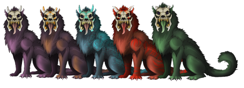
2016-02-05 [The Dizzy Raven]: Those are adorable :D
2016-02-06 [Eyonic]: arent they :D i am working on another pose for them and going to have them as adoptables on my art site. also working on this big guy:

2016-02-16 [The Dizzy Raven]: Awesome!! :D
2016-02-18 [Eyonic]: kazu, it seems like you is the only one left to comment! such sadness :(
2016-02-18 [The Dizzy Raven]: Yeah.... Sometimes I feel like I'm the only one on ET anymore :/
2016-02-21 [The Dizzy Raven]: ^_^
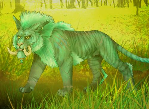
Also, lovely tiger :D
2016-02-26 [Eyonic]: thank you ^.^
2016-02-26 [The Dizzy Raven]: You're welcome :D
| Show these comments on your site |
|
Elftown - Wiki, forums, community and friendship.
|